When the NFL switched its official apparel contract from Reebok to Nike, fans naturally began to wonder what changes Nike would make to their teams' uniform.
Dolphins fans were being pitched ideas like this which would give the team a completely new and modern look. Even though the orange helmet doesn't seem to fit here, it wouldn't be too bad of a change.
We also saw ideas like this one. I'm a big fan of this design, but I just don't know where the dark blue comes from. This would be a great addition to the Dolphins wardrobe to maybe wear once a year, like the orange uniforms.
There were even designs that would make them look like a high school team. These are just plain bad. There's no flow to them and the logo looks weird.
We also saw designs that blended the old school with the new school in these uniforms. These were probably my favorite combination. The all white uniform does an excellent job of mixing the two concepts, and the gray looks like it would also be used about once a year, like the orange uniforms.
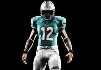
Given these possible designs, I expected a lot of changes to the uniform but was surprised when I saw the uniforms unveiled. I do like the the design, but there's no change that really stands out. The area around the neck has a new design that I think gives it a nice look.
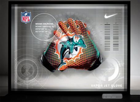
Nike will also implement their new gloves with the logo on the inside. Hopefully Dolphins' receivers will be able to put them to good use this season.
Overall I was content with the new design. They kept the old look, which I think is still current enough, and gave it some more modern details without changing much.